Have you ever clicked on a website and instantly felt connected—or repelled?
That feeling isn’t random. It’s the result of carefully crafted visual psychology working in the background. And in today’s competitive digital landscape, where every business is fighting for attention, your website design isn’t just about beauty—it’s about influence.
Web design is a powerful psychological tool that shapes how people perceive your brand, how much they trust you, and whether they take action. Whether you’re a small business owner, a startup founder, or a local service provider, this isn’t just theory—it affects your bottom line.
In fact, multiple studies confirm that:
As a freelancer WordPress developer, I’ve helped dozens of clients not just “look good” online, but actually use design psychology to generate leads, bookings, and revenue.
In this article, I’ll take you deep into how modern design taps into user behavior and emotions. You’ll understand why:
And most importantly, you’ll see how hiring a professional—be it a freelance website developer or a WordPress website design company—ensures you don’t just get a website… you get a growth engine.
When someone visits your website, they’re not reading every word. They’re scanning. Skimming. Judging. And they’re doing it fast—in under 1 second.
That’s not an exaggeration. A famous Google study proved that users form opinions about a site’s visual appeal in as little as 50 milliseconds. That’s faster than a blink. And once that opinion is formed, it becomes very difficult to change.
They’re not just reacting to your message—they’re reacting to how it feels to look at your site. Here’s what most users subconsciously evaluate in that crucial first second:
If your website fails any of these checks, trust starts eroding—fast. And that means lost leads, no matter how good your services are.
This is why business owners seeking WordPress development services or website design and development companies must prioritize more than just features. A solid first impression builds trust and signals professionalism—critical if you want people to stay, engage, and convert.
Design isn’t just about making things look pretty—it’s about communication. Visual trust is the idea that your design choices immediately tell a visitor: “You’re in the right place. We’re professional. You’re safe here.”
Here’s how great design creates trust:
Let’s say you’re a service-based business offering home cleaning or consulting. If your site feels outdated or hard to use, it subconsciously tells users that your service may be unprofessional or unreliable—even if that’s not true.
Compare that to working with a WordPress web design agency or a freelancer WordPress developer who builds your site with clarity, precision, and strategy. The result? More trust. More time spent on the site. And ultimately, more conversions.
Let’s get real for a moment. People don’t buy from businesses they don’t trust.
So if your website is your first impression, and it looks dated, slow, or confusing, you’re losing money—daily.
On the flip side, when you invest in smart, modern web design rooted in psychology, you get:
And here’s the beauty of it: good first impressions are predictable. When you work with an experienced website development consultant or custom website development company, they know how to engineer trust through design. It’s not luck—it’s strategy.

Color isn’t just decoration. It’s a psychological trigger. And in web design, your color palette can make or break a user’s perception of your brand.
Every color choice—backgrounds, buttons, headings, even accent lines—sends a signal. The brain processes color faster than text, which means before your visitor reads a single word, they’ve already felt something.
And as a freelancer WordPress developer, I can tell you: when your color choices match your audience’s expectations, you create instant alignment. But when they clash? You risk confusion, hesitation, and high bounce rates.
Let’s break it down.
According to research by the Institute for Color Research, up to 90% of a person’s first impression of a product or brand is based on color alone. That’s a huge psychological lever—and smart businesses use it well.
Color affects how people feel, and those feelings influence how they act.
Here are the emotional associations most commonly tied to color:
| Color | Emotion/Perception | Best For… |
| Blue | Trust, security, professionalism | SaaS, consultants, legal, medical |
| Green | Health, growth, harmony | Wellness, eco brands, agriculture |
| Red | Energy, urgency, excitement | Sales pages, food brands, flash offers |
| Orange | Creativity, friendliness | Startups, kids’ brands, casual services |
| Yellow | Optimism, warmth, happiness | Coaches, lifestyle, solo creators |
| Black | Luxury, sophistication, power | Fashion, tech, premium services |
| White | Simplicity, clarity, purity | Health, minimal brands, local services |
Let’s look at how color psychology applies across different industries—especially those hiring for WordPress development services or custom website development:
These audiences value trust and clarity. Soft blues and fresh greens can create a calming, professional tone that feels safe and knowledgeable.
Bonus: White space enhances the effect, signaling transparency and openness.
If you’re selling high-end fashion or luxury accessories, use dark, sleek tones. Black backgrounds with gold accents communicate exclusivity and elegance.
Many top ecommerce website design services use this exact combo for premium products.
Plumbers, electricians, or medical clinics benefit from clean, professional designs. A white or light background with blue accents gives a trustworthy and dependable vibe.
A website design and development company building local service websites often sticks to this safe and conversion-friendly combo.
Startups in media, education, or tech love energy. Orange and yellow bring fun, positivity, and modern appeal. These colors feel more “approachable” than blue or black.
Used well, they give off enthusiasm—but avoid overuse, or they can feel immature.
If there’s one place color psychology matters most—it’s your CTA (Call to Action) button. This tiny piece of UI design can influence whether someone clicks “Book Now,” “Buy,” or “Get Started.”
Best Practices for CTA Buttons:
Example:
A custom website development company might use a bright blue CTA on a white background to signal trust and action. But for a lifestyle brand, a coral or orange CTA might feel more personal and engaging.
When designing a WordPress site or ecommerce store, choosing colors isn’t just a design decision—it’s a conversion strategy. A freelancer who understands this psychology can custom-tailor your palette to:
That’s why businesses investing in website design and development services must go beyond templates. Your brand deserves thoughtful color decisions that align with your customer’s mindset—and that starts with a developer who understands both tech and human behavior.
When visitors land on your website, they’re scanning—not reading line by line. Their eyes follow predictable paths, especially on desktop. And if your site layout isn’t built to guide their attention, they’ll likely miss the most important parts of your message.
This is where visual hierarchy comes in—a core design principle that directs your visitor’s focus using size, spacing, contrast, and placement.
A website with strong hierarchy feels easy, intuitive, and trustworthy. One without it feels scattered, confusing, and overwhelming.
Visual hierarchy is the arrangement of elements in a way that clearly communicates what matters most.
Think of it like reading a newspaper:
On a website, the same logic applies:
This is standard in professionally built websites from any experienced WordPress website development company or website and app development company.
Eye-tracking studies (especially by Nielsen Norman Group) show that most users follow an F-pattern when scanning websites:
This creates an “F” shaped pattern—horizontal, horizontal, vertical.
As a freelancer WordPress developer, I use this behavioral pattern to structure content and design layouts that match user expectations.
How to Design for the F-pattern:
A good layout doesn’t just look balanced—it drives action. Here’s how to design a layout that respects hierarchy and user behavior:
Keep only one clear action per page (especially on landing pages). Too many buttons or choices confuse users.
Use font size and element scale to indicate importance. Your main CTA button should be larger than everything else on the page except the headline.
Break long pages into scannable sections with headers, dividers, and images. People don’t read walls of text.
On simpler pages (like a homepage or short landing page), a Z-pattern layout works well—left to right across the top, down diagonally, then left to right again.
This is a go-to layout for ecommerce website development services, especially for product pages.
Don’t try to fill every inch of your site. Strategic spacing improves clarity and focus. It’s used intentionally by every great website design and development company to improve readability and user comfort.
Let’s say you’re a service-based business like a cleaning company, and you hire a WordPress development services provider to build your website.
Here’s how a strong visual hierarchy might look on your homepage:
This layout builds trust fast, guides the eye, and encourages action—all within seconds.
Here’s something many DIY website owners miss: people don’t scroll unless they’re hooked. If your layout doesn’t grab attention above the fold, they may never make it to the good stuff below.
That’s why I always build client sites with attention mapping in mind—thinking through where users will look first, second, third… and where they’ll click.
A good layout answers:
These aren’t just design choices—they’re business decisions backed by psychology.
Many cheap website templates ignore visual hierarchy altogether. They look pretty, but they don’t convert.
Only a professional—whether it’s a custom website development company or an experienced freelancer WordPress developer—knows how to combine layout psychology, brand voice, and strategy into a site that actually performs.
That’s the difference between a $5,000 website that generates leads—and a $500 one that looks nice but sits idle.
User Experience (UX) is the heartbeat of modern web design. While visual design catches attention, UX design is what keeps people moving through your website—and ultimately taking action.
UX is all about how people feel while interacting with your website. Is it smooth or frustrating? Confusing or intuitive? Helpful or overwhelming?
If your site looks nice but feels clunky to use, you’re silently losing leads.
And here’s the thing: great UX is invisible. Visitors don’t notice it when it’s good, but they immediately sense when it’s bad.
When business owners think of hiring WordPress development companies or website design and development services, they often focus on aesthetics. But UX goes much deeper.
Good UX means:
And most importantly: friction is removed at every step.
Even the best-looking websites can suffer from UX issues. Here are the most common mistakes I fix when doing redesigns for clients as a freelancer WordPress developer:
When users are overwhelmed with links, buttons, and sections, they freeze. This is called decision fatigue, and it kills conversions.
Fix: Focus on one clear CTA per page. Simplify your menu to 5–6 core items max.
If people don’t instantly know where to go for what they need, they leave.
Fix: Use familiar terms (“Home,” “Services,” “Contact”) and test navigation on both desktop and mobile.
According to Google, if a page takes more than 3 seconds to load, more than 50% of users will bounce.
Fix: Compress images, use caching, and choose a lightweight theme—especially for WordPress website services.
With mobile usage dominating, a site that doesn’t work on phones loses serious trust (and Google rankings).
Fix: Ensure responsive design, clickable buttons, and legible fonts on all screen sizes.
If your contact or booking forms are too long, unclear, or buggy, users drop off.
Fix: Keep forms short (3–5 fields max). Make errors easy to spot and fix.
Flow is the rhythm of your site—the way one section leads naturally into the next. Done well, it gently guides the user toward your goal.
Think of it like walking through a well-designed store:
That’s exactly how a high-converting homepage or landing page works. The content is structured in a way that leads users without pushing them.
This is one of the key reasons businesses invest in website building services or hire a website development consultant—to build structure, not just style.
Good UX focuses on micro-actions—small moments where users interact with your site. These include:
Each micro-action builds engagement and nudges the user closer to conversion. The more of these interactions a visitor completes, the more likely they are to trust your business.
That’s why UX is a psychological game: small details add up to a big experience.
Many entrepreneurs assume UX is just a “design thing.” But it’s a revenue thing.
Great UX does three things:
This is why UX is non-negotiable in professional website making services or when building any ecommerce website.
I’ve rebuilt websites that went from 1% conversion rates to over 6%—just by simplifying navigation, improving mobile usability, and tightening page flow.
A smart custom website development company or skilled freelancer WordPress developer will often test their UX decisions through:
Even small tweaks—like changing a button label or moving a testimonial higher up—can dramatically improve conversion rates.
UX isn’t flashy, but it’s incredibly powerful. If visitors feel lost, confused, or frustrated, they’ll leave—and likely never return. But if they feel guided, comfortable, and informed, they’ll stay and take action.
That’s the kind of experience every business owner wants—and every high-performing website delivers.
If you’re planning a redesign or starting fresh, don’t just think about design. Think about how it feels to use your site. That’s where the real magic—and money—is.
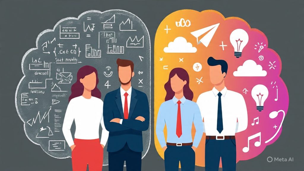
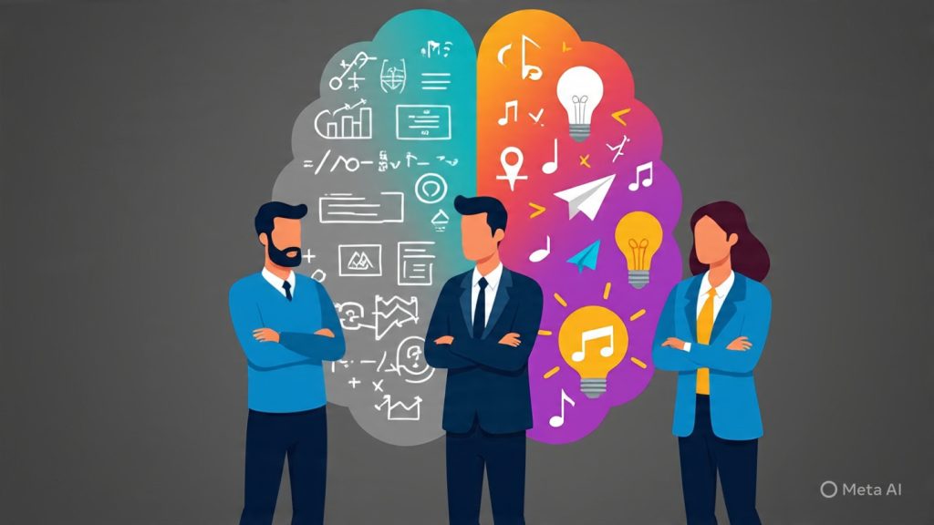
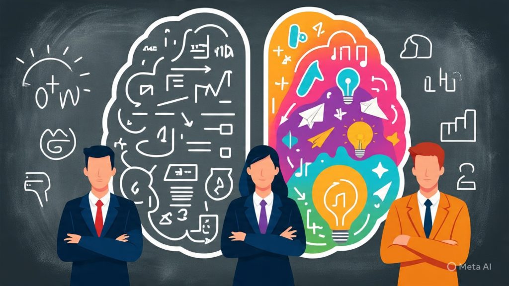
Web design is not just about how your website looks or functions—it’s about how it influences behavior.
Every user comes to your website with mental shortcuts known as cognitive biases. These biases shape how they interpret your content, how much they trust your brand, and whether they take action.
The best WordPress development services and custom website development companies understand how to use these psychological patterns to design websites that convert.
Let’s explore the most important biases that impact user decisions—and how you can use them ethically to increase leads, sales, or signups.
One of the most powerful principles in marketing and web design. Social proof tells visitors: “People like you have already trusted this brand.”
That’s why it’s critical to display:
How to use it: Place testimonials on key conversion pages like your homepage, services, and contact page. Add a short quote with a photo or logo for maximum impact.
Websites using WordPress website design company services often integrate testimonial sliders or video reviews—these convert far better than text-only.
People fear missing opportunities—this is why FOMO works so well in web design.
You can activate this bias with:
How to use it: Add urgency to lead-gen pages or your service inquiry form. For example, “Book before July 31 to get 10% off custom website development services.”
⚠ Important: Use FOMO authentically. Fake urgency damages trust.
People make decisions by comparing one thing to another. The first number they see (the anchor) heavily influences their perception of value.
That’s why pricing tables are so powerful.
How to use it:
💡 If you offer website redesign services or ecommerce website development services, anchoring helps showcase ROI clearly.
When faced with too many options, users freeze or delay decisions.
That’s why your homepage should focus on one or two CTAs, not five. And your service pages should help users quickly choose the right package—don’t make them overthink.
How to use it:
A well-structured, professionally designed site by a freelancer WordPress developer can streamline user flow and dramatically improve your lead generation.
Repetition builds trust. The more people see your name, colors, logo, or offers, the more familiar—and trustworthy—you become.
This is why consistent branding and layout matter.
How to use it:
Every great WordPress web design agency builds familiarity into the structure of your site—it’s not just about design, it’s about building trust over time.
Psychologically, people feel more pain from a loss than pleasure from a gain. So your site should emphasize what users will lose if they don’t act.
How to use it:
Especially relevant for website and app development company offerings, where the impact of poor UX or slow performance costs real money.
People trust authority. When you showcase credibility, certifications, or press mentions, visitors are more likely to believe you.
How to use it:
This is why building a strong personal brand—as a website development consultant or freelancer WordPress developer—can make a huge difference in conversion rates.
Understanding cognitive biases helps you design for the user’s psychology—not against it.
Instead of guessing what might work, you’re creating a site that aligns with how the human brain naturally processes choices, trust, and action.
This is the real difference between a DIY site and a professionally built website using proven strategies. You’re not just getting a site—you’re getting a sales tool built on science.
Ever wonder why Facebook is blue, or why fast food brands often use red and yellow?
It’s not random—it’s psychology.
Colors trigger emotions, shape perception, and heavily influence how users engage with your website. For small businesses, startups, and local service providers, getting the color palette right can literally be the difference between trust and bounce.
This is where working with a professional WordPress website development company or custom website development services provider really pays off. You’re not just choosing colors—you’re choosing how users feel about your brand in seconds.
Studies show that users make a subconscious judgment about a product within 90 seconds, and up to 90% of that decision is based on color alone.
In web design, colors influence:
For example:
When your freelancer WordPress developer designs your site, these colors aren’t just chosen because they “look nice.” They’re mapped to your brand identity and goals.
Let’s break it down by industry—so you can better visualize how color strategy fits your website’s objectives:
When you hire a WordPress web design agency or custom website development company, these choices are based on audience psychology—not personal taste.
Contrast is where color psychology meets usability.
Your primary goal is to make important actions stand out. That means:
High-performing websites—especially for ecommerce website development services—use color-driven user flow. One color = one action. Repetition builds familiarity and encourages interaction.
Colors must also be usable for all users—including those with color blindness.
This is where professional website design services make a difference. Developers use tools like:
You might have the most visually pleasing site, but if users can’t read your buttons or navigation—you’re losing leads.
A freelancer WordPress developer with UI/UX expertise ensures both beauty and functionality.
Let’s say you’re a near me website developer offering digital solutions to local cafes.
If you build a site using brown, green, and cream tones, it creates a cozy, organic feel—perfect for the brand. But the “Order Online” button in a vibrant red or orange grabs attention without feeling off-brand.
This is design psychology in action. Every color works with the brand, not against it.
Color psychology isn’t about following trends—it’s about using science to shape perception and behavior.
When you invest in custom website development services, you’re not just paying for design—you’re paying for strategic decisions that influence how your audience reacts, remembers, and responds to your brand.
For freelancers, startups, and business owners looking to build emotional connections, color is a foundational tool.
Design psychology isn’t just theory—it’s about action. Whether you’re building a fresh website or refining an existing one, here are high-impact changes you can make today to create better experiences, drive more conversions, and grow your brand presence online.
These strategies reflect the insights of top WordPress development companies, and can be implemented affordably by hiring a freelancer WordPress developer or an expert in website design and development services.
First impressions form in under 3 seconds. Your homepage should communicate who you are, what you do, and what users should do next—without making them scroll too far.
Quick wins:
Your navigation should be simple, intuitive, and limited to 5–7 key items. Confusing menus cause cognitive overload and increase bounce rates.
Checklist:
Over 60% of users will view your site on a phone. If your layout is clunky, fonts too small, or buttons too close, you’re losing leads fast.
Pro tips:
If mobile usability isn’t a priority, your website development consultant should make it one.
People trust people. Testimonials, logos of clients, certifications, and case studies reduce friction and increase trust.
Best practices:
This is one of the easiest ways to boost conversions without changing your design.
Refer back to the color psychology section and ensure:
A custom website development company or freelance website expert can audit and refine your current setup.
Never leave a user wondering what to do next. Whether it’s contacting you, signing up, or viewing your services, give a clear CTA on every page.
CTA Examples That Convert:
Make your CTAs specific, benefit-driven, and visually distinct.
Many business owners overload pages with keywords or use generic AI-written text. That kills trust.
Do this instead:
An experienced WordPress website development company balances both sides: content that’s search-friendly and conversion-focused.
Psychologically, users associate fast sites with professional brands. A 1-second delay in load time can reduce conversions by 7%.
Speed-up checklist:
Ask your PHP website development expert or developer to run speed audits regularly.
Want users to click something? Point to it—literally or visually.
Design cues:
These subtle psychological nudges can significantly improve conversions.
Don’t let visitors dead-end. Every page should naturally lead to the next action or resource.
Example user flows:
Use internal links, buttons, and strategic design to guide users seamlessly through your site.

When built right, your website becomes your most valuable digital asset—selling 24/7, educating leads, and establishing your brand’s authority.
But that only happens when design, psychology, and strategy come together—something most drag-and-drop builders can’t do alone.
If you’re serious about growth, it’s time to stop treating your website like a checklist item and start using it as a conversion machine.
Whether you’re launching a new venture, rebranding, or simply want more results from your online presence, a skilled freelancer WordPress developer can help translate design psychology into real business value.
Why does web design psychology matter for small businesses?
Psychology influences how users perceive, trust, and interact with your website. A well-designed site based on behavioral cues can drive higher engagement, conversions, and customer retention—especially crucial for small businesses where every lead counts. Strategic color use, clear navigation, and trust signals can create a memorable and persuasive online experience.
How can a freelance WordPress developer apply psychology in web design?
A skilled freelancer understands how users think and act online. They’ll implement psychological principles such as the Von Restorff effect (highlighting key CTAs), visual hierarchy, and emotional triggers using color, layout, and messaging—ensuring every page works toward user action, not just aesthetics.
What’s the connection between website speed and psychology?
Speed directly impacts user satisfaction and perception. If your site takes too long to load, users subconsciously associate it with unprofessionalism or low trust. Fast-loading websites feel modern, reliable, and worth exploring—this is psychological framing at work.
What elements create trust on a website?
Trust comes from clean design, consistent branding, visible contact info, client testimonials, SSL security (HTTPS), and clear CTAs. Social proof—like reviews, certifications, or real-world results—can significantly boost credibility, especially for service-based businesses.
How does color affect user decisions on a website?
Colors evoke emotions. Blue builds trust, red creates urgency, green suggests growth, and black implies luxury. Choosing the right color palette based on your brand tone can psychologically nudge visitors toward desired actions. Even small changes in button color can impact click rates.
What is the cost of web design that includes psychological UX/UI strategy?
A psychology-driven website isn’t always more expensive—but it’s more effective. With freelance options starting from ₹8000 to ₹45000, you can get a strategy-focused, conversion-ready design that goes beyond templates. It’s a smart investment when you want your website to deliver real ROI.
Is it worth hiring a freelance web developer for a small business website?
Absolutely. Freelancers often provide better flexibility, personalized attention, and lower website development costs compared to large agencies. Plus, they can implement custom strategies tailored to your industry, goals, and audience—especially if you’re seeking practical results, not just a pretty homepage.